

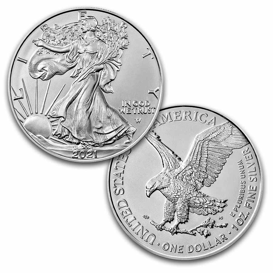
2021 Type 2 Silver Eagles - What's the Difference?
Posted by Toby Adkins, Numismatic Scholar for currencyandcoin.com on Jul 29th 2021
There is little doubt that the new American Silver Eagles are one of the most anticipated coins in modern coin collecting. It has been whispered about, written about, and debated about for more than a decade. This edition is not going to be about the process but the differences in the coins themselves. However, before we do go into the differences, we do have to ask... Why change the design to begin with? It's the most popular coin in the world, it's beautiful, and affordable. So, WHY?
One of the main reasons has to do with an ever growing problem within the coin industry: counterfeits. Since the Silver Eagles are so popular, and have been around for so long, it is one of the most counterfeited coins out there. Possibly, only the Morgan Silver Dollars are more counterfeited than the Silver Eagles. Many other countries have already began taking extra efforts to stop this problem with their own precious metal offerings. For years, the Mint has been pressured to make some changes. To address this on the Type 2, the Mint removed one of the reeds along the edge of the coin below the date. Also, the incredible detail is another problem for counterfeiters to reproduce. It may not sound like much but it definitely increases the difficulty of reproducing it.
The second reason is a little less practical but has good repercussions. New designs are good for coin collecting and for the U.S. Mint. We are all well aware of the excessive spending within the government! It's not a a new problem. However, the Mint is one of the few parts of our government that is consistently profitable. The mint makes money literally and physically, pun intended. The design change is also taking place on the 35th anniversary of the program. It's a good time for the change... and a good reason for the Mint to sell you two of everything!
The Differences
Now, on to how they are different. Let's start with the reverse since it is the most notable change. Gone is John Mercanti's Heraldic Eagle design we all know. After an extensive contest within the Mint's Artistic Infusion Program a new design was chosen. Emily Damstra's design of a flying eagle holding an oak branch is now the new look. To the left of the branch you will see her initials- ESD. To the right of the branch are the initials MG recognizing the engraver, Michael Gaudioso.
Another change on the reverse is moving the mint mark from the left side to the right. On the Type 2 it will be placed on the right side, in the field above the eagle's tail. The mottos and legends also have a different look and are shifted to allow the design to reach all the way to the rim of the coin. The U.S. Mint released some images to easily see the changes.
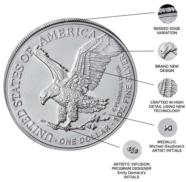
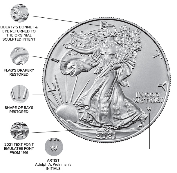
On the obverse, the changes are more subtle. There is no doubt the Type 2 certainly carries more detail. It's design is very close to Weinman's original work. One noticeable addition is the "AW" below IN GOD WE TRUST. This is for Adolph Weinman, the original designer of the famous Walking Liberty look. Upon inspection you can easily see the missing reed from either the obverse or the reverse side.
Overall, the coin's detail is remarkable. Some collectors may not like all of the changes but the coin is beautiful. The design change has added some new life into a long running program. Fortunately, all of this is good for our hobby. Happy collecting!